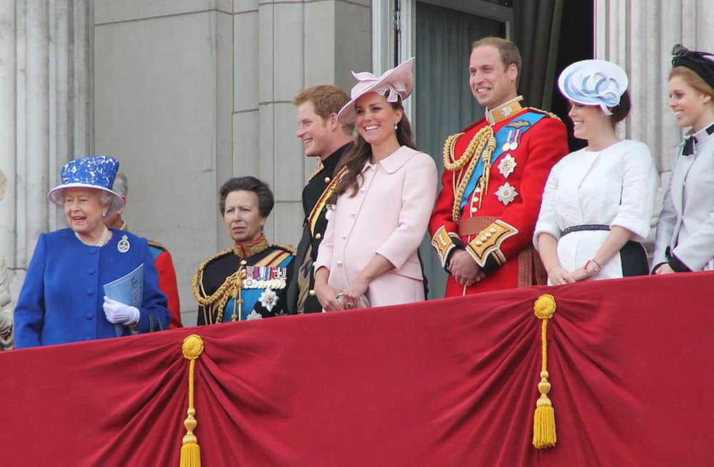
I recently read an article in “The New York Times” that covered a visit to Berlin by the members of the Royal Family: The Duke and Duchess of Cambridge and their two children, Princess Charlotte and Prince George.
Clearly, the visit was planned from a logistics point to ensure their on-time arrival and that all appointments were orchestrated to flow from one to another. But there was another dimension to the visit that made a non-verbal statement that left a long-lasting impression, and that was the color of the clothes they wore on arrival. The choices were deliberate. The styles were planned, and the respect and sensitivity that was demonstrated through clothes spoke volumes to the host country and city.
Events professionals know that the first impression is the one that lasts the longest. It lasts the longest because what we see stays with us and is 80 to 90 percent accurate in recall. We speak in color; it is a language. So when former Kate Middleton emerged from the plane wearing a Berlin Blue coat and dress, The Duke coordinated his tie and the children were in a blue dress and blue shirt and shorts, respectively, the visual statement and sign of respect needed no words.
The color statement went beyond the typical trend to follow a country’s designer—this was a country’s color. It’s hard to overstate the importance of color trends, forecasts and predictions in our society. Often, these forecasts start in the world of fashion and eventually make their way into interior design, restaurants, hotels, and then meetings and events. That means that perceptions of, and emotional associations with, colors can and do shift from year to year.
In addition to trends used for meetings and event décor, culture-specific color associations are critical for the planner to understand—and wear. Failing to understand the intonations and meaning of color in different cultures means leaving yourself open to huge and perhaps unforgivable mistakes, such as using a color for celebration that represents death or insult within the society where your event is being held. Individual color response can come from social mores; reaction to color is based in part on those powerful learned responses and on the language color speaks in our minds and bodies. Georgia O’Keefe said, “I found I could say things with color and shapes that I couldn’t say any other way—things I had no words for.”
“In addition to trends used for meetings and event décor, culture-specific color associations are critical for the planner to understand—and wear.”
Whenever we are working in a culture that is unfamiliar, we must do our research and ask local experts to share their knowledge about the best color choices. What works in Indiana may not work in India, and what works in India may not work in Indonesia. In other words, there are always strong cultural factors to take into account—and the visual statement, the sense of sight, makes a very big impression.
Each participant may respond in a unique and independent way to the colors chosen for an event. This means that extensive discussion and research and inquiry is always a good practice prior to working or interacting with an international culture. The more important and high level the event, the more carefully the color choices must be vetted.
When you hear the phrase, “a picture speaks a thousand words,” take heed. When you look in the mirror, what do you see that will make the first impression to your clients? I used to have a practice of wearing the same color to my event. I suggest you try it, and experience the impact.


